
Tuesday, April 3, 2012
Isoline Map
Thematic Map

Thematic map is a very general term used to describe a map that deals with the subject of a specific theme- that is, it portrays data, visually, for a specific region, that has to do with the whatever theme the cartographer wishes to portray. The themes are endless, ranging from social, to cultural, to political, to economical, etc. This particular thematic map portrays the basic resources and processing for the country of Belgium in the year of 1968. The resource shown in blue is coal, and the processing of iron and steel share a symbol, nonferrous metals share a triangular symbol, and petroleum has its own intricate symbol. This map is great for showing an overly simplified view of where the major resources or processing may take place in the country, and reminds me of the old empirical Roman military maps, both in simplicity as well as pictogram representation of the elements.
Population Density: Choropleth Map

A Choropleth map is a thematic map that measures whatever the specified unit is throughout a specified region. Choropleths come in various shapes and sizes, and depict various types of information, including statistical information such as per capita income and population density. The above map is considered a choropleth population density map, and allows for the visualization of the data that is collected from the US Census regarding the most populous regions in the U.S. through the use of various shades of red; the more saturated the red, the more saturated the area is with people.
DOQQ Map

http://www.lacoast.gov/maps/2005doqq/
A DOQQ Map stands for a Digital Orthophoto Quarter Quad map and are usually produced by the USGS from digital aerial photos. These maps are especially important in that they remove the distortion of areal photos and provide a clean and neat flat map that accurately measures variables such as distance and area. This particular map shown here is of the 2005 Louisiana Cost, taken aerially, after the Hurricanes Rita and Katrina hit the coast. Maps such as these are useful in depicting the areas most influenced by the Hurricanes, and where efforts should be concentrated in order to continue seeing results.
Similarity Matrix

Mapping the Southwestern U.S. using Digital Line Graph

A Digital Line Graph is another type of map derived from a USGS map, and can be comprised of up to nine different categories of features. This particular map of the Southwest United States depicts the major cities, roads, railroads, hydrography, boundary, and federal lands.
Population Density Map: US 2000

http://www.uni.edu/gai/India/India_Lesson_Plans/India_Population_Pyramids.htm
Population pyramids are useful tools in displaying geographic information in terms of age and sex distributions throughout specific regions of the world. These tools are specifically imperative to sociologists in mapping trends specific to fertility rates, mortality rates, population sustainability, etc. This example of three population pyramids shows the various forms a pyramid has, and what those shapes mean. For instance, Kenya's pyramid shows high fertility rates and mortality rates, thus rapid growth among the population, while the U.S. has fairly stable grow (our fertility and mortality rates are just at the sustainable level) and Germany has negative growth, that is, there are lower mortality rates and lower fertility rates showing the aging of their population is outshining their growth.
Cartographic Animation Map: Temporal

Cartographic Animation Maps are used to show the change over a period of time in certain areas of the word, and have become increasingly more popular throughout the years. This particular cartographic animation map was used in order to display realization results and visualizing spacial data. The graph shows the most optimal paths that came to be from the results, as it was impossible to display 250 potential paths one could take to traverse this specific terrain.
Isopach Map: Southern England and English Channel: Purbeck Formation

An Isopach Map is a map that depicts the various thicknesses within a single stratum. The term Isopach refers to the actual contour line that joins together areas of equal thickness. This particular map is of the Purbeck Formation in Southern England and the English Channel. This formation, thought interesting from a geological, should not be taken as just a natural phenomenon which we wish to explore. The map shows the variety in thickness of the rocks and cliffs surrounding the bay and is used to warn those who wish to live on the unsteady cliffs or traverse the sound of the dangers of such unsteady and diverse geological regions.
Isohyet Map of Seasonal Precipitation: Burkina Faso, 1992

Another type of weather map, an Isohyet Map portrays the average precipitation of a given geographical location (region) through the use of isohyet lines, or lines that connect points of equal precipitation on a map. This particular map shows the seasonal precipitation of Burkina Faso in 1992. The map is very basic, and points only the 138 rainfall stations, as well as the 'ground truth location.' This map is used in a paper that discusses the correlation between the areas with most rainfall and the areas with the most vegetation.
American Isotach Windmap
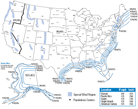
An isotach is a line found on a typical weather map that connects points where equal wind speeds have been recorded. The map pictured above depicts the wind speeds found at approximately 33 ft above ground throughout the United States of America (both the continuous states, as well as Alaska, Hawaii, and other territories). The values that are shown were recorded over a period of three seconds for each value, and is measured in miles per hour. This map is used to show prospective clients that the concrete poles manufactured by this company (StressCrete) are able to withstand the average wind speeds found throughout the United States.
Isopleth: Rainfall in Barcelona June 2002
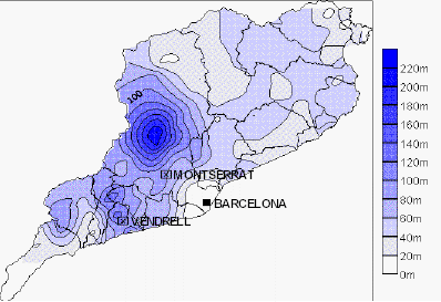
An Isopleth is a map that portrays similar data through the use of shading regions with similar values in similar colors, and are best for showing the gradual change over a period of time. This particular isopleth shows the precipitation in June in Barcelona in the year of 2000. It is easy to depict the various meters of rain that fell throughout Barcelona, and the areas with more concentrated rainfall, however, it would be difficult to see if the rainfall was not continuous or if it was abrupt given the slight change in shading.
Planimetric Map of Iraq

A planimetric map is a basic map that depicts only the horizontal position of features, and does not take into account elevation. Planimetric maps are linear, and could be considered the opposite of a topographic map due to its basic (one-dimensional) properties. The map pictured above is a basic planimetric map of Iraq. As you can see, only major cities, roads, lakes, rivers, bodies of water, and oil refineries are depicted in this map, and there is no concept of elevation what so ever.
Correlation Matrix: Sunshine Profits

A Correlation Matrix shows how various sets of data correlate with one another in order to produce a clean and organized quantitative interpretation of data. In this particular matrix, the variables being correlated are the profits for various precious metals over the course of a specific number of days, ranging from 10 to 750.
Star Map: Winter Solstice Beyond 45 Degrees

A star plot allows us to compare various aspects of a single observation that would not benefit from the averaging of numerical data. In this particular case we are able to see a single starplot comparing the judgements of a team to the actual test score of the student, per section of the test. There are five different test elements, each of which are represented as a radius from the center of the starplot, and include Letter identification, Hearing and Recording, Concepts about Print, Word Reading, and Writing Vocabulary.
Hypsometric Map: Pik Lenin

A Hypsometric Map is a map of the surface that also shows three dimensional information occurring above the surface. The formal definition, according to our notes, also implies that the information communicated on a hypsometric map is generally in the form of relief shading, contouring, or color and shaping. This particular map of the border between Tajikistan and Kyrgyzstan, known as Pik Lenin, is a typical hypsometric map that displays the shaded relief of the elevation through the use of three different colors or tints, as referred to on the website. The basis of the topographic map was taken from different Russian army maps.
Triangular Plot: Flammability Diagram for Methane

A triangular plot is a visualization tool that graphs the ratios of three separate variables on an equilateral triangle, in order to show how they relate to each other. These plots are especially beneficial in that they allow three separate variables to be plotted on a simple two dimensional graph, thus they aide in the organization of data, much in the same way that 'traditional' maps do. This particular triangle plot is the depiction of the flammability of methane in relation to the ratios of nitrogen and oxygen present.
Wind Rose

A wind rose is a circular plot that depicts the frequencies of various wind directions over the course of some specified period of time, for a certain area. This wind rose, in particular, shows the wind speed in the Bellaire area. According to this graph, the wind speed in Bellaire is on the lower side, as the North winds cool the summer and winter, the south winds being blocked by the hardwood forest that is found to the south of the city, and the west winds which happen to be their primary source of exposure to winds. Maps such as these are great for a number of reasons, ranging from deciding how to design a golf course to regular inquires on climate.
Parallel Coordinate View: Cells and Nine Selected Genes

Parallel Coordinate Plots are used to explore the possible relationships between variables. In this particular parallel coordinate plot each Drosophilia gene is represented by one parallel axis, while the expression leveles of each cell are plotted as an individual point on the axis. Each cell is then represented by a polyline, and we are able to visualize an otherwise complicated set of data: the expression of multiple genes at the same time (in parallel). This plot was used to organize the data collected on the relationship between DNA and genetic expression with regards to animal development.
Histogram Map of Traffic Delays in America

A Histogram displays the frequency of an occurrence in an easy to read geovisual graph. This particular histogram depicts the number of hours people spend delayed in traffic in a particular region. The information used to publish this graph was derived from statistics in 2007 and was featured in Time Magazine in November of 2007. This graph was a part of a visual display of the difference in population from day to night in major cities. For instance, the most populous city during the day, NYC, is comparatively empty at night, thus the hours of traffic delays are endured by commuters, or the very people that cause NYC's population to increase during the day.
Box Plot: Annual Snow Levels

A Box Plot is a simple geovisualization tool that shows the summary of a set of data. This is simplistic in that it highlights four key points: the average, the median, and the 'measures of dispersion;' that is, the highest and the lowest of the data collected. This particular box plot graphed the annual snow depth for a fictional ski resort using a five figure summary (the numbers previously mentioned that where needed to create a box plot), that is, the lowest depth in centimeters and the highest depth in centimeters, the halfway point between the lowest and the median, and the halfway point between the median and the highest. The range at the bottom shows begins at 0 cm of snow and ends up at 140 cm of snow.
Stem and Leaf Plot: 12 years of Dance Lessons

A stem and leaf plot is a type of geovisualization that plots a set of numbers from greatest to smallest, allowing the eye to quickly see where the median and/or average numbers are located for the particular data that has been plotted. This particular Stem and Leaf Plot, derived from a North Star Math online learning tool plots the number of students enrolled in a dance class in the previous twelve years, thus there are 12 numbers to be graphed.
Scatter Plot: More Experience = More Pay

Index Value Plot: Stocks

An Index Value Plot is a graph that plots an indexed value, as opposed to an absolute number, and all plotted values are relative to the indexed value. In this particular example of an index value plot for stocks, the raw arms index is plotted, but proves too volatile for any form of deduction, thus, proving that for an Index Value Plot to successfully show an economic trend, it must be indexed over a number of days. For this particular situation, if the plot is an average of the stocks for 10 days, then the information portrays noticeable troughs and peaks.
Bilateral Graph

A Bilateral Graph is a geovisualization tool that graphs two related variables. This particular bilateral graph graphs the number of suicides per area (referenced by numeric pole) on the San Fransisco Golden Gate Bridge over the course of the last 75 years (since 1937, when the first person jumped). The even numbered polls are on the west side of the bridge and depicted as the top numbers, while the odd numbered polls are on the bottom. This is useful in displaying the information pertaining to a geographic location in an organized and visual manner, without being just another map.
Lorenz Curve: Greece 1951-2001

The Lorenz Curve is a type of geovisualization that typically shows how data would be graphed if income were distributed equally, and is known as a cumulative distribution function. This particular Lorenz Curve shows the population disparities for different areas in Greece and different nationalities. Instead of showing the typical percent of income vs. percent of family, this curve graphs the percent of the population and percent of the land area, per year, through the use of a GIS- and shows that the farther the curve is from the diagonal, the more concentrated the population is in this particular region
LIDAR Map of New Orleans: Flooding from Hurricane Katrina

A LIDAR map uses laser as opposed to radio or microwave radiation, and thus is known as a type of remote sensing that uses light detection and ranging. This map combines the use of aerial photography and LIDAR in order to produce a map that shows the levels of flooding that occurred throughout New Orleans as part of Hurricane Katrina. This was particularly useful to the NOAA office of response and restoration, FEMA and the U.S. Coastguard in locating the highly flooded areas and the hazardous materials in said waters.
Infrared Aerial Photo: Vegetation Patterns

An Infrared Aerial Photo is another type of remote sensing, however, these photos use colors to depict the various wavelengths that the human eye is incapable of sensing. This particular picture is very useful when photographing vegetation as certain types of vegetation are able to be distinguished through IR film by their reflective properties (and the color of the film). Water and land contrasts are similarly distinguishable through the use of this type of film. This particular photo shows vegetation patterns- the arable fields making up the background, and one area of uncultivated peat bog appearing in white.
Black and White Aerial Photograph of Toronto, Canada

Black and White Aerial Photographs are used in cartography in that they are a type of remote sensing, which, by definition, is the science of identifying, observing, and measuring an object (or region) without coming into direct contact with it. This particular type of aerial photograph uses film that has been coated with a light sensitive emulsion that is comparable to a human eye's sensitivity to wavelengths. That is, black and white photographs show what we can already 'see.' The above pictured black and white aerial photo is of Toronto, Canada between 1960-1972 that depicts single-family homes and apartment complexes beside a highway. These series of aerial photos are important in that they show the progression of the city through its various buildings and building growth (the later years show more homes, thus one may assume that population also increased).
Cartogram Map: Europe 1868

Cartograms are a type of map that are able to communicate the relative scaling of map properties, that is, distances may reflect similarities other than miles, while areas are reflected to show relative differences in attributes. The above map has been attributed to Emile Levasseur, and was produced in 1868, as a value by area cartogram of Europe.
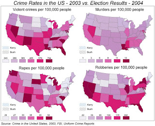
Bivariate Choropleth Map: Crime and Election Rates
A Bivariate Choropleth Map is a choropleth map that depicts two different variables simultaneously through the use of two different data sets for the same region (and two different symbols). For instance, the map pictured here shows the crime rates in the United States of America in 2003, as well as the Election results in 2004. Crime rates were assigned a color (light to dark pink, saturation implicating the number of crimes per 100,000 people) and the election results were measured based upon final 'win' for the state. This map, in my opinion, is attempting to find a correlation between political affiliations and dangerous crimes committed in a certain area.
Proportional Symbol Map: France, 1850

Proportional Circle Maps are maps that utilize circles to map point data, as opposed to a dot, thus the size of the circle plays an important role in relation to the measured variable, and not necessarily the area over which it is measured. This map, drawn by Charles Joseph Minard in the 1850's depicts the amount of different types of meat that came from various regions and were sent to butcheries in Paris. Both area and variable (meat) play a significant role in this particular map, however, the measured variable, or amount of particular type of meat that is sent to Paris determines the size of the circle.
Unclassed Choropleth: France

An unclassed choropleth map, such as the one pictured above, is a map that displays areal data for, however, the information is not grouped into smaller groups, such as in a classed choropleth map. This particular map of France, drawn by Charles Dupin in 1826, boasts the dubious title of first choropleth map, however, his unclassed style made it difficult to portray information comparitively, as each value was given its own unique color. Though not perfect, this map was the basis upon which cartogrophers were able to build and grow to disover other variations of this choropleth map.
Classed Choropleth: 1828 Prussian Atlas

A classed choropleth map is a choropleth map that has combined the data for states, countries, regions, etc. into smaller groups which are then portrayed in intervals. The techniques to create a classed choropleth include taking equal steps, quanitiles, natrual breaks, and minimal varience, that is, each group has to be as homogenous as possible within the group, but as different from the other groups as possible. In the above classed choropleth, printed in a Prussian Atlas in 1828, the author of the map used color to signify the various class breaks, which can be seen along the bottom of the map.
Standardized Choropleth Map: Generic Names for Soft Drinks
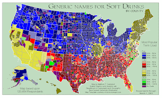
A Standardized Choropleth Map is a choropleth map that has been areally averaged, that is, its information has been standardized to some unit- most commonly, area- as opposed to being a total value for an area. This map, which depicts the various generic names for soft drinks per region, was standardized to a percentage of people who use the term per area. Though this is a silly representation of a standardized map, it highlights the ease of use of this type of map, though observations made must be fairly general, as there is no specific numeric information for an area.
Nominal Area Choropleth Map: Iranian Ethnic Groups

A Nominal Area Choropleth Map is a map that portrays qualitative, categorical areal data. There is no implicit ordering, rather, data is classified into groups. Nominal Area Choropleths are generally of the more basic variety, that is, they do not show elevation or a thrid demension, but relay numerical information about the area being mapped. Above is an example of a Nominal Area Choropleth Map displaying the various ethnic minorities that persist throughout Iran. This map is useful in the assesment of the situation of human rights as these ethnic and religious groups continue to control certain areas of Iran. This is also helpful in the assement of what groups 'rule' what land, and what resources are in that region of Iran.
Dot Distribution Map: Value of Crops

A Dot Distribution Map is a type of point pattern map that uses dots as a nonproportional point symbol, and each dot represents a specified value. This particular dot density map displays the value of crops that were sold throughout the United States of America in 1992. Each dot represents a value of 10,000,000 dollars of crops sold within the area in an attempt to highlight the best land for agriculture in relation to agricultural crop production.
Continuously Variable Proportional Circle Map

A continuously variable proportional circle map is a type of proportional circle map which utilizes circles, in stead of dots, to map points, and the size of the circle generally relates to the variable being mapped, as opposed to the area being mapped. The map displayed above showcases what the 1970's cencus population data might have looked like if it was mapped in the 'real world.' That is, it shows us what are the more populous areas, and just how dense certain areas were.
Digital Raster Graphic: Western Washington D.C.

According to our slides, a Digital Raster Graphic is a 'scanned and georectified USGS topoquad.' The DRG is used as a base for other maps, and is tied into a datum. The above map is a portion of the Western Washington D.C. DRG, drawn between 1995 - 1998. DRG's like this one may be used as the basis for other maps, or to create 'hybrid' maps such as a combination of this DRG with a digital elevation map to create maps that accurately depict elevation or 'shaded-relief' maps.
Digital Elevation Model

A Digital Elevation Model, or DEM, is a type of USGS digital map product. The above DEM was colored and rotated in order to 'bring our relief,' of the Hawaiian island Kauai. This particular map was used, more specifically, to show the elevation and topography of the island in order to find a route to hike up to the Waialeale Plateau.
Topographic Map of Stowe, Vermont

Topographic maps indicate another layer to the latitude and longitude of a map, generally surface features and elevation, the latter of which is depicted through continuous contour lines. The numbers represent elevation (either in feet or meters). Above is an example of a topographic map of the city of Stowe, Vermont. As you can see, the contour lines depict the higher elevations within the city, which are labeled accordingly, i.e. Cady Hill and Taber Hill and Lower Village (lacking the constant contour lines).
Statistical Map: Coal Production in Don Basin

Statistical Maps are important because they are able to represent distances that are relative to properties other than physical distance, and thus use 'relative scaling.' For example, this particular map depicts the Coal Production in Don Basin, with the size of the the coal carts depicting the amount of coal produced.
Propaganda Map: Japan, 1905

Propaganda Maps are used to shape how people interact and conceptualize the world, and were used historically to depict political views. For instance, this Propaganda map made by the Japanese just before the 1905 Russo-Japanese war illustrates the negative views on Russia, as it entitled "the Black Octopus," and clearly shows this Octopus' arm resting upon the territories that they both wanted to claim- Manchuria and Korea.
Climograph: Tropical Monsoon Climate

Climographs link location and climate, thus, are considered maps in that they communicate information about space, place and the relationship among objects. This particular Climograph displays information on the climate in Mangalore, India, or the "Tropical Monsoon Climate." One could deduce, from reading the graph, that the highest temperatures occur just before the most precipitation (or it is hottest just before the rainy season begins).
Doppler Radar: Hurricane Andrew 1992

A Doppler Radar is used to estimate two parameters, reflectivity and rotational velocity, the former provides information on the type of precipitation and its intensity, the latter on the speed and direction of the storm. This is measured through the Doppler effect, and is particularly important for measuring and detecting Hurricanes. Above is a Doppler Radar of Hurricane Andrew: a category five hurricane that hit Florida back in 1992. Up until Hurricane Katrina, Hurricane Andrew was the most expensive Hurricane, resulting in approximately 26 billion dollars in damages.
Mental Map: The New Yorker, December 2002, Cover Page

A Mental Map is a 'highly abstracted representation of real world locations.' That is, a mental map is a map in that it depicts abstracted representations of concrete places and spaces, in other words, it's a map of perception of the world. This map in particular, taken from the cover of the New Yorker in December of 2001, renames the boroughs of New York, satirically, to represent the countries and or regions neighboring Afghanistan (the soviet republics). This representation highlights the U.S. mentality towards this particular region of the world, given the recent attacks of 9/11 that had occurred only three months prior.
Cadastral Map: Costa Rica Property Security

Cadastral Maps are maps that depict the ownership of land and can either be systematic or unsystematic. The above map is a Cadastral Map of Costa Rica, which was recently implemented by the "Registro Nacional" as a part of the new real estate certificates for property owners in Costa Rica. The article boasts heightened security for overseas investors as the 'new' map offers owners a view of exactly what they own, and how close to the water it is.
Flow Map
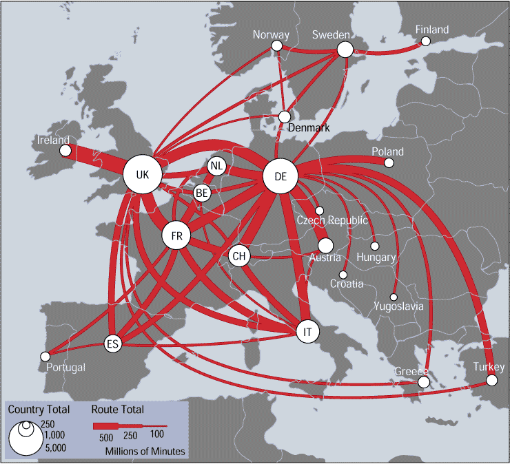
A Flow Map, as defined by Phan in 2005, is a map that shows the movement of objects from one location to another. According to Harris in 1999, flow maps have the ability to show the movement of both tangible as well as intangible things, such as this map pictured here, which displays the telecommunication traffic between European countries. The flow of communication is depicted through the red lines, and the thickness of the lines is proportional to the number of minutes of voice communication the respected countries engage in which each other, measured in millions of minutes. This particular map is identified as a part of the new branch of geography and cartography known as telegraphy, which studies the mapping of voice and electronic data.
Subscribe to:
Posts (Atom)